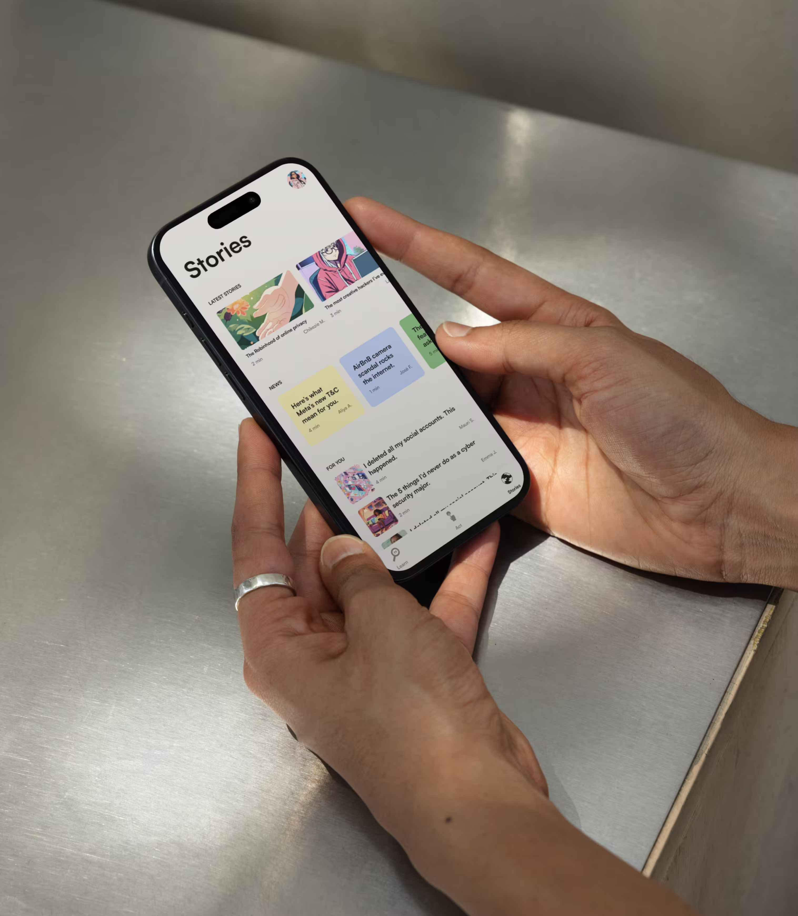
Become your own internet bodyguard.
PERSONAL PROJECT
JUST ME AND THE COMMUNITY
JUST ME AND THE COMMUNITY
Timeframe
8 weeks
Role
UX researcher
Design strategist
Interaction designer
Visual designer
UAT buddy
Methods
Competitive analysis
1:1 interviews
Participatory design
User flows
Rapid prototyping
Visual design
Usability testing
Tech stack
Google Docs
Sketch
PasteApp
Medium
Project team
Just me *waves*
where it started
93% of Americans are worried about their privacy online. Yet, most feel completely powerless to do anything about it.

MY ANSWER
Introducing Koju.
A mobile app that challenges you with one question and one action a day. In about 5 minutes a day, you build your awareness of what personal security means for you and your ability to protect yourself online.


INCEPTION
This project idea stemmed from two things.
.avif)
1) my own feelings of powerlessness as someone who’s online 80% of the time, and 2) exploring my responsibility as a contributor to our digital landscape.
But the intention was to build something that would serve the wider community (not just me). So, my first move was to validate this problem space, through primary and secondary research. This first phase confirmed that this was an issue for folks who use the internet to any extent, and that there was no pre-existing solution solving for it.
Say less :)
GOING ON THE FIELD`
To understand the beliefs, experiences and feelings people had around their online privacy, I conducted 8 interviews with men and women between 24 and 54 years old.
I made sure to select people of all levels of familiarity with the internet. After analyzing the research data and teasing out patterns and core insights, I distilled the findings into empathy maps to refer to during concepting.

KEY PAIN POINTS
Five pain points both were recurrent and emotion-inducing (hypothetically, great motivation for behavior change).
01 / We lack visibility
...into what data is being collected, when, and where it goes.
02 / We’re unclear on what the “threat” even is
The research participants I interviewed had the feeling of being a potential target for the entire world – from big tech companies to ill-intentioned individuals in a basement.
03 / The game and its rules are always changing
...from the technology itself, to its regulation.
04 / The carrot called “convenience”
The convenience of highly customized online experiences (informed by our personal data) directly competes with our desire for privacy.
05 / Feeling out of our depth keeps us from even trying
Mic drop.

WHAT’S THAT, IN PIXELS?
Getting lost in designer land is easy. To anchor my design process into my users’ experiences and needs, I translated these pain-points into design principles to could refer to as I went.
01 / Straightforward language
No jargon, just clear, gentle-on-human-brains language.
02 / Low barrier to task completion
Would you even *entertain* Duolingo if each lesson felt like a ToughMudder challenge? Exactly.
03 / Goal-focused journey design
Users of the app would sign-up with the intention to become better equipped at navigating wild Internet waters. Here, the intention was to fuel their momentum sustainably, and reflect their advancement back to them in a motivating way.
04 / Positive affirmation and fun
The research group tended to associate the mere thought of online privacy with stress. For them to stick around long enough to learn to protect themselves online, I had to make learning about online privacy feel good.
FAILING FAST
I generated and refined solutions by rapid-prototyping and user-testing each iteration.
Through 7 rounds, I was able to identify solutions to the different pain-points and integrate them into a cohesive“one-stop-shop” app.
At each iteration, I’d consult with engineer friends to keep me honest re: feasibility. They tore my first concept (an app that monitors your activity on your phone, lets you know how safe you’re being, and teaches you customized ways to protect yourself better) to pieces – because before protecting users’ privacy this way, I’d have to seriously breach it. All the time.
Which made led me to the education-focused approach I ultimately landed on.

With the testing data, I solidified the key product features that effectively empowered users with the skills to protect themselves online. I also refined the interactions that made these features most engaging, intuitive, and fun.
I used a user journey map to conceptualize those key features as a cohesive experience, and a system map to keep track of how the different components interconnected within the experience.


POLISH TIME
Once I had worked out functionality, I designed Koju’s visual identity to convey warmth, friendliness and approachability paired with a trustworthy sense of authority.

OVER TO YOU
Let’s be real, case studies can be an absolute bore. How did this one feel? Let me know here in under 2 mins. I read every single one and implement on the patterns that ~reveal~ themselves.
ROOM FOR ONE MORE?